
Result
Result • October 2
This post is a follow-up to “Education,” where we built an AAPL daily chart and explained concepts referred to here.

Here is the August 27 AAPL chart built with EMAs, Fibonaccis, & Volume Profile. I thought it would be helpful to review the results and see how the tools work.

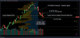
The annotated chart above from six trading days later on September 6.
EMA Crossover – the bearish signal of the shorter EMA crossing under the longer EMA turns the cloud red. The trend flip occurs many days after the recent peak because EMAs are lagging indicators.
Fibonacci ‘Tests’ – note the candle interactions with Fibonacci levels, and look for confirmation of the level holding. Note the .38 tests & fail, as well as the .50 test.
Volume Pivot – The large volume shelf on the profile (static from Aug 27) serves as a pivot from support to resistance on the last candle. In the top chart, the last candle pushed down through a volume node on significant volume. The target would’ve been the next volume node below it. You don’t need to wait for an indicator to point out that idea when using VPA.
These tools identified the target. My eyes were immediately drawn to the golden zone (.618-.65 fibs), a key retracement area for fibonacci traders. The ‘volume desert’ (low volume region on profile) above the zone was another useful signal. That volume gap was also supported by the VPOC (highest volume in the histogram). The areas together – VPOC & golden pocket – showed confluence, strengthening conviction in the technical target.

Disclaimer: I’m not short AAPL (prefer SPX puts). I wasn’t, nor will I ever recommend you do anything with your money.
These tools informed a bearish thesis on AAPL with a target of the golden pocket & VPOC. A bounce out of that region on strong volume would have been a near-term bullish signal. A failure of that region confirms the bearish thesis and warrants a lower target. Every signal needs to be confirmed with follow through. One candle does not suffice.
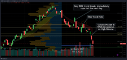
The above Sept 30 chart reviews the Sept 6 target, 24 trading days after the original chart. Note that the EMA trend was broken only once, and the next daily candle respected the line perfectly. The EMAs were tested and held again a few days later. The golden pocket & volume point of control served as near (not exact) support for the stock on the hammer candle followed by a bullish engulfing candle. The 3rd from last candle bounced on high volume in that region. The following candle failed that region at open, and the price has been plummeting since.
(slide picture left to right)
Hopefully I’ve understandably displayed these tools and clearly explained my interpretation of their movements. I find these tools useful, and think everyone should find tools which work for them.

Education
Education • August 27
Building an AAPL daily chart

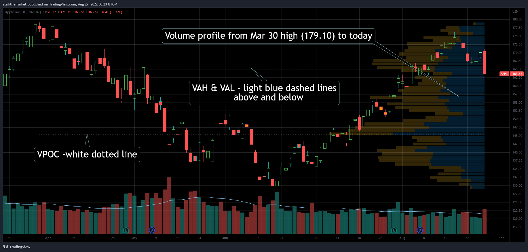
- Volume Point of Control (VPOC) – highest volume bar in the histogram
- Value Area – 70% of the volume within the histogram, bracketed by the:
- Value Area High (VAH) & Value Area Low (VAL)
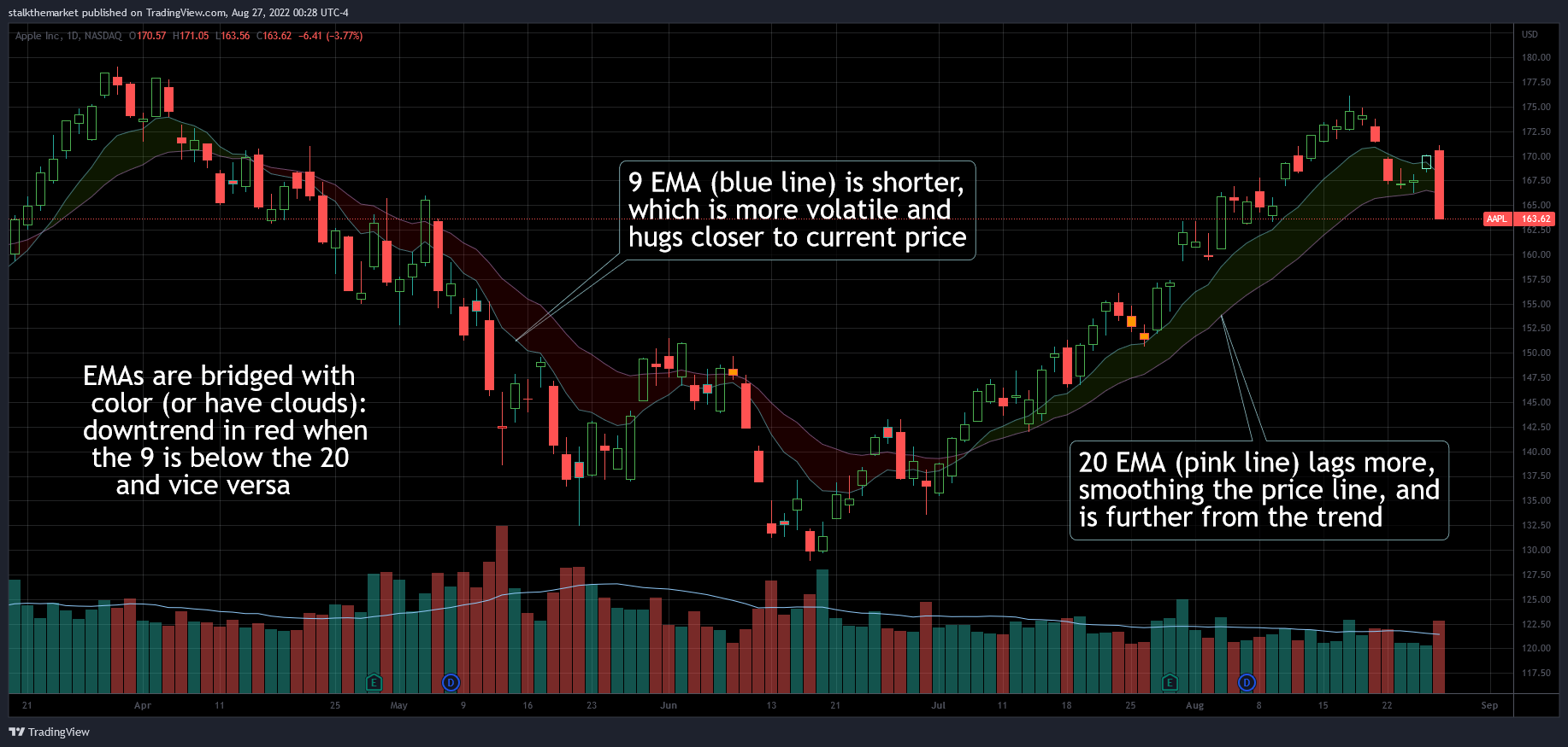
- Simple (SMA) – average price of timeframe specified
- Exponential (EMA) – a higher weight of recent prices calculating the average
One could argue both, either, or neither SMA/EMA levels are valid. The 200 day SMA (mean of the last 200 days) is a highly psychological long term trend commonly discussed in financial press. My favorite EMAs are the 9 & 20. I like shading between the EMA spread, creating clouds – a visual tool that slaps you in the face with a trend.
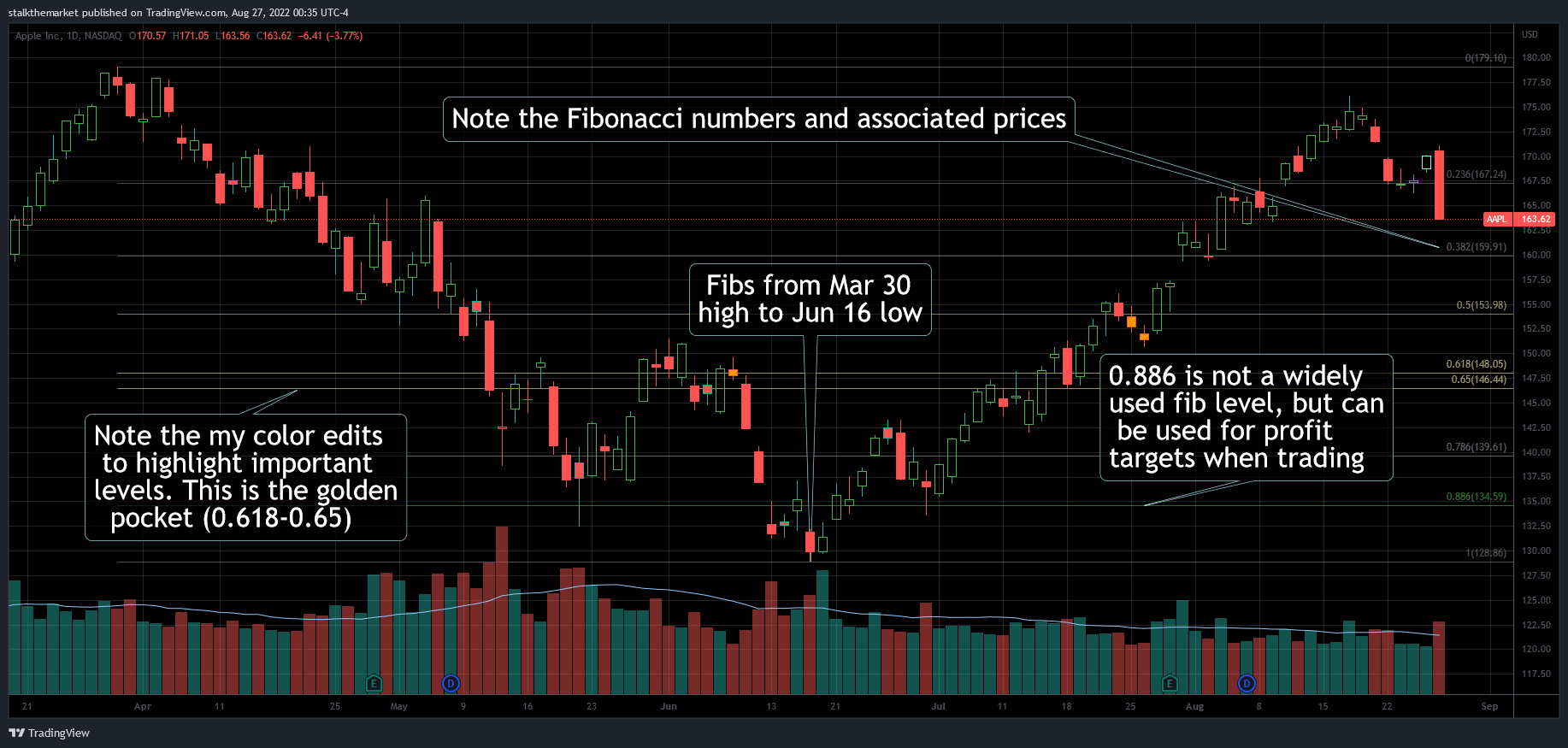
Fibonaccis are a set of ratios based on the numerical sequence. Named after the Italian mathematician who brought the ancient Indian study home, fibs [as they’re called] are an incredible tool. I plan to opine on the subject in another post.
(slide picture left to right)
Putting it all together looks kind of busy, right? Or does it add context? Using only a few tools helps to filter out the noise. That’s why I like to have my annotation color settings in higher transparency. Otherwise, it’s best to just do it naked. Always good advice.
Charts
*Disclaimer: While in the markets for over a decade now, I haven’t been drawing on charts but a few years. I’m not a technical analyst, just a trader/investor who enjoys technical analysis. There is no value in drawing a bunch of indicators all over a chart. I’m just having fun.
Charts • March 14

Quick start with oil. Drew these weekly levels going back to 2008 a few weeks ago. It still amazes me today how large volume levels left on the chart affect current price….regardless of how many times it works. Hourly chart blown up to display price interacting with the levels.
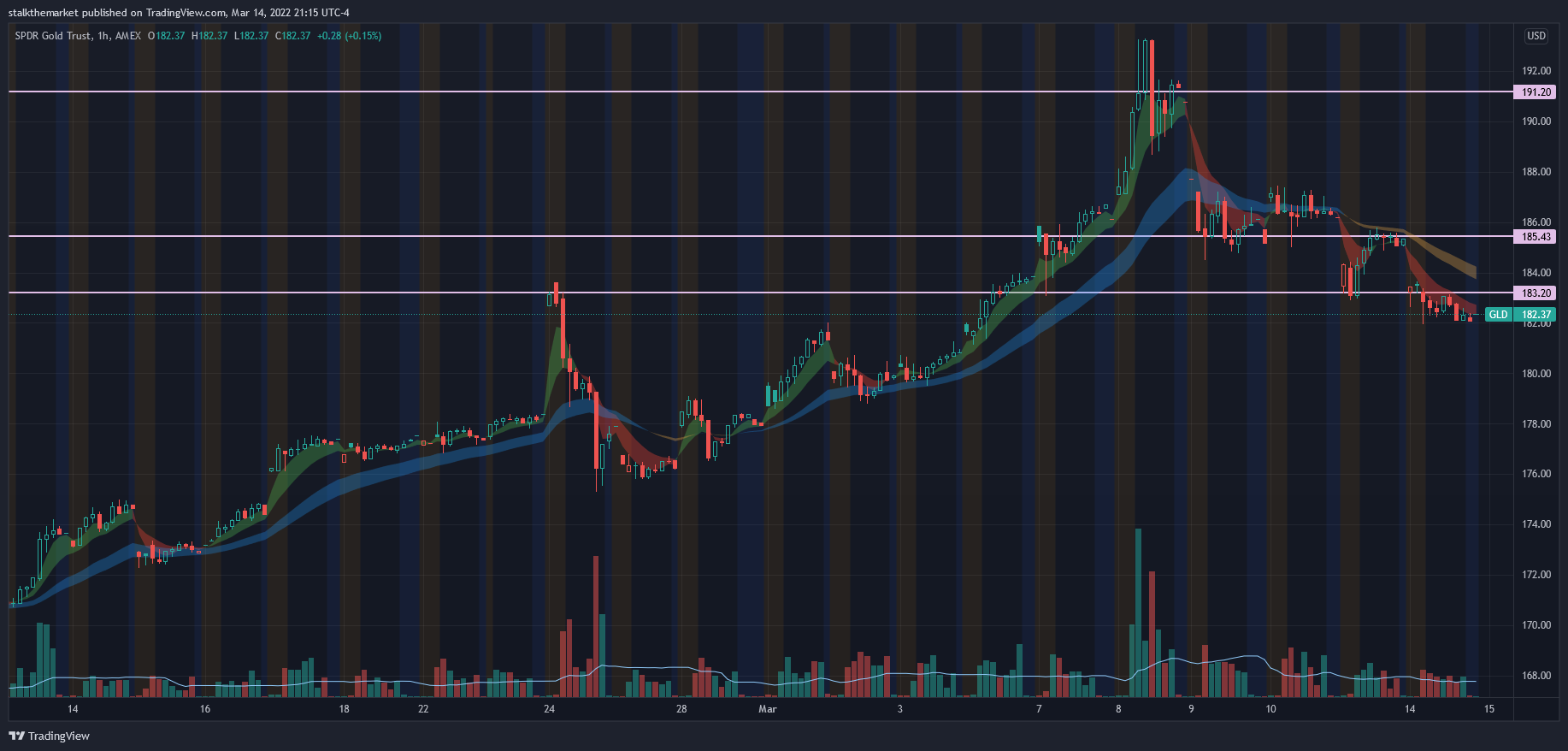
Quick on gold – today, I drew these weekly lines going back to 2011 & Aug 2020. Furthering the point in one of my favorite chart drawing concepts I learned a couple years ago. “Look left,” as they say. Hourly chart.
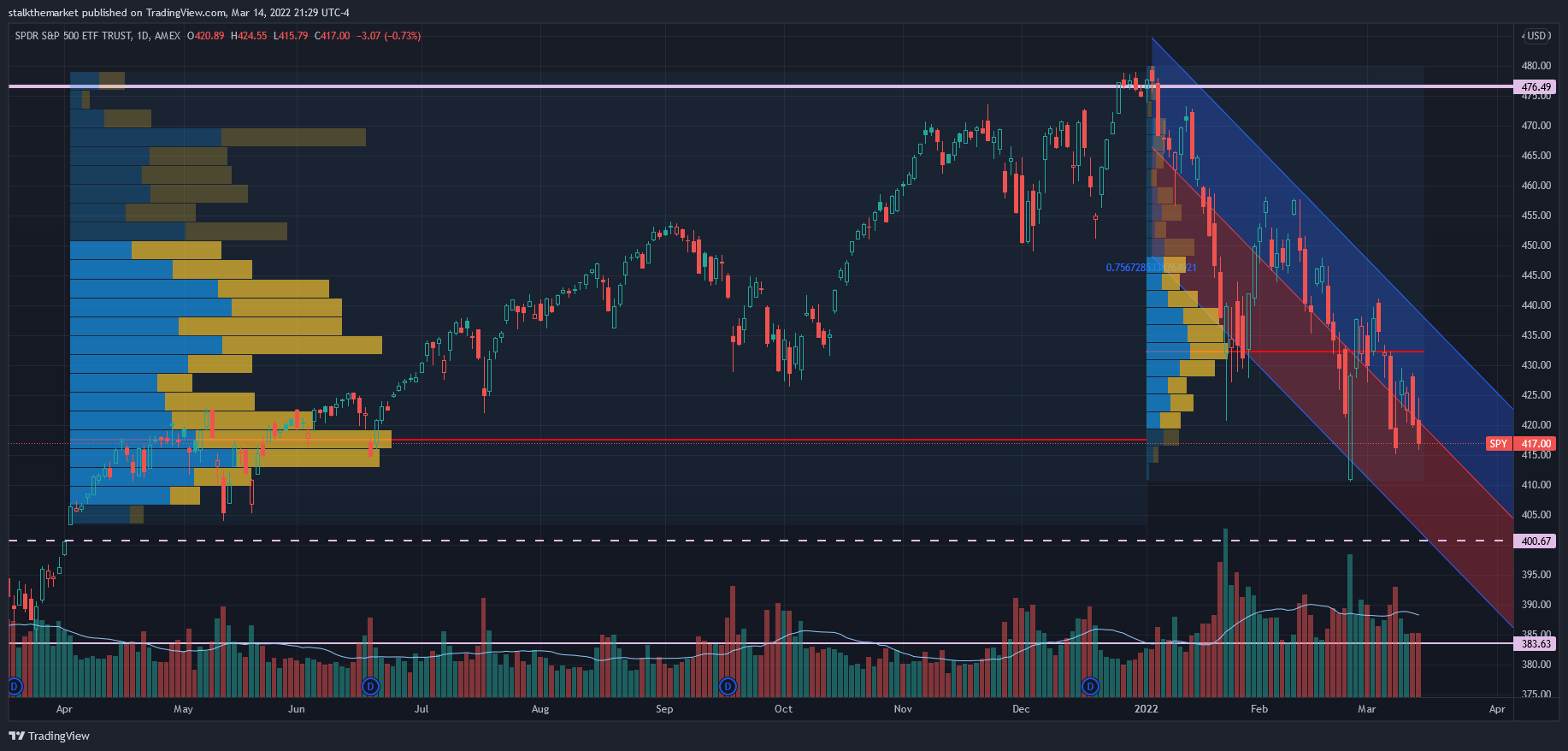
OKAY SPY. I got really cute with this chart – bear with me. First, I don’t think drawing junk all over a chart brings impact, if nothing else, it is unnecessarily distracting. The blue/red channel is one I drew a few weeks ago, just extending the right of the channel on the chart. Volume profiles display volume interacting with price points over the period you’re viewing. I drew two: The breakout in April 2021 through year end (Left), and YTD (Right).
Not necessarily a realistic indicator of demand and supply, consider it a chart of where the bodies lie. I started learning Volume Price Analysis a few years ago – the art of reading candles and volume alone. The volume profile is an applicable part of this process. Notice how the prior Volume Point of Control (VPOC – solid red line) lines up almost perfectly with current price (thin dotted red line).
Things are breaking down. Rothschild: “the time to buy is when there’s blood in the streets.” While a true statement, I’d prefer to miss a little upside waiting for clarity, than attempt to perfectly catch the ‘bottom.’